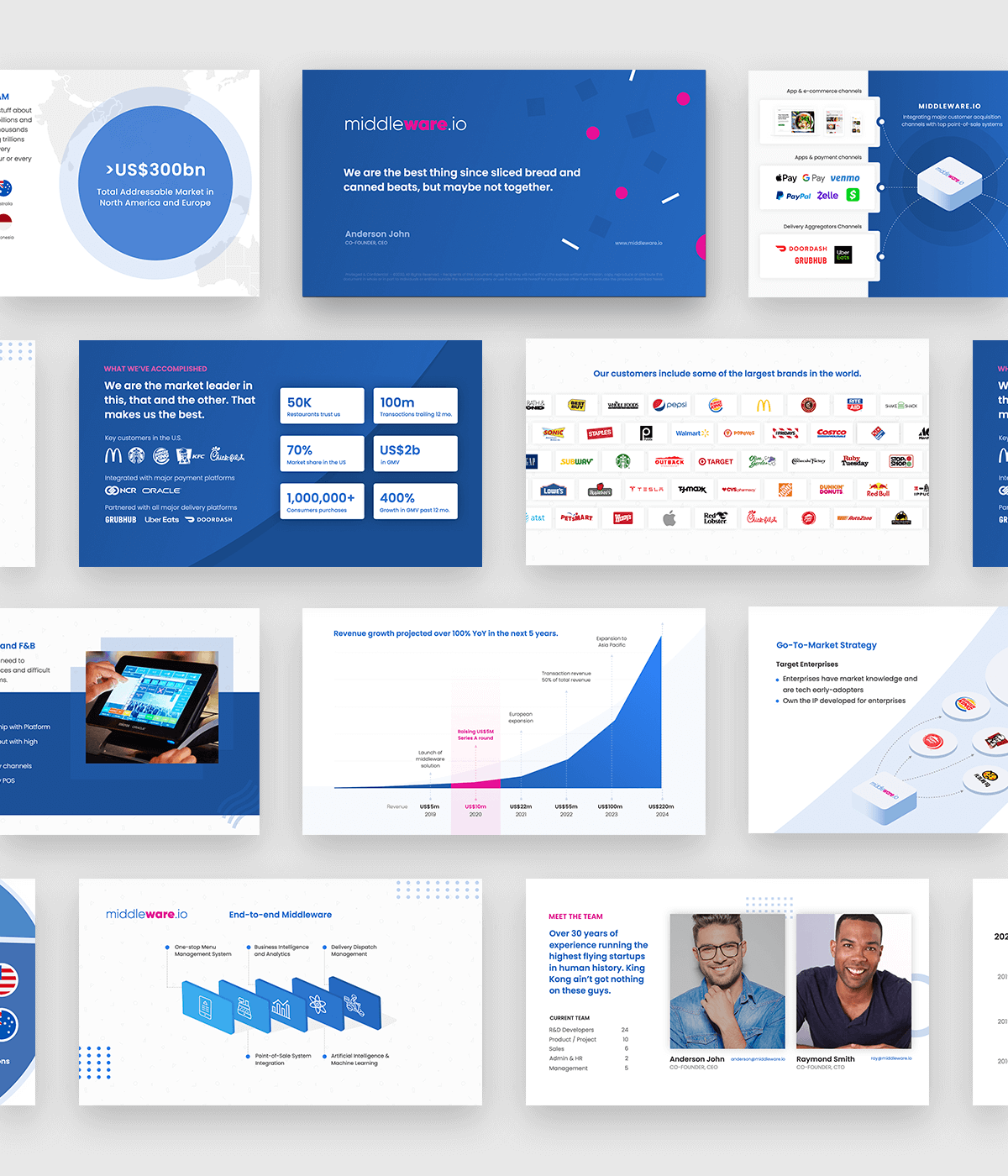
Having launched several startups and now an early stage investor myself, I am often asked to assist companies in formulating their investor pitch decks. Often times, that includes the visual design of the presentation. Contrary to what some may think, I feel designing a pitch deck can be just as challenging as designing a website. First off, the stakes are usually higher as it’s the one document that may help you in raising thousands or even millions of dollars. Secondly, canvas size on Keynote or Powerpoint is limited on each slide. With a pitch deck, you’ll need to tell an impactful story, demonstrate your product and show traction to convince an investor that you are worthy of their investment. All while trying to keep in line with your branding visually, or at the very least, make it look like you put some effort into it.
This project was to help a company in the midst of raising a round of funding to design a pitch deck that organises their data in an easy-to-read manner, while injecting some effective graphics design to enhance the storytelling. Much of the data has been changed for this portfolio piece, including the name of the actual company and all the data that you see. It is merely here to showcase the design styles that I delivered to this client.


Comments are closed.