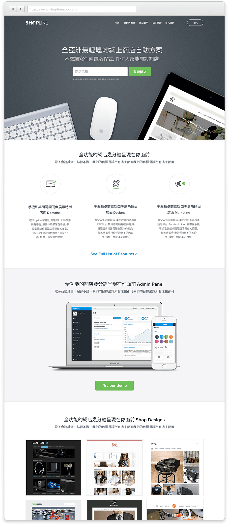
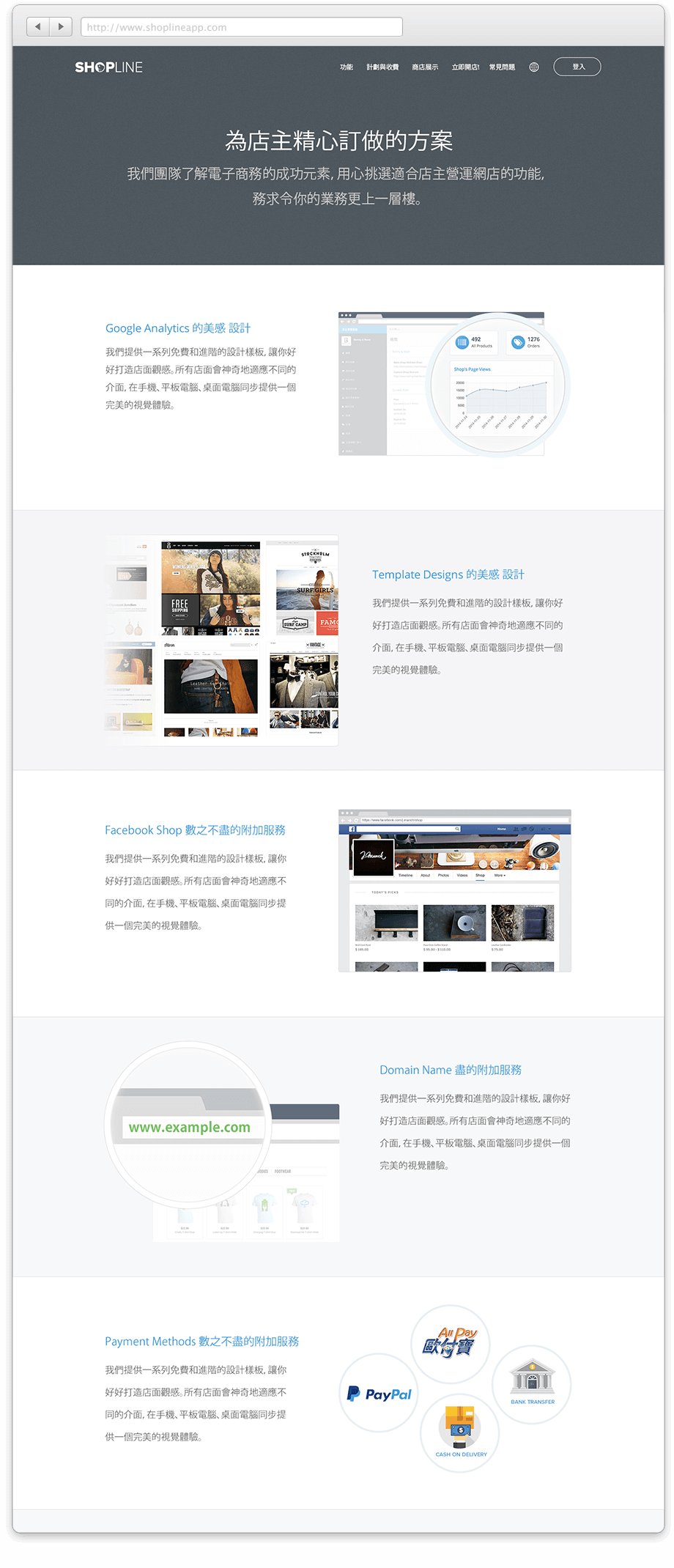
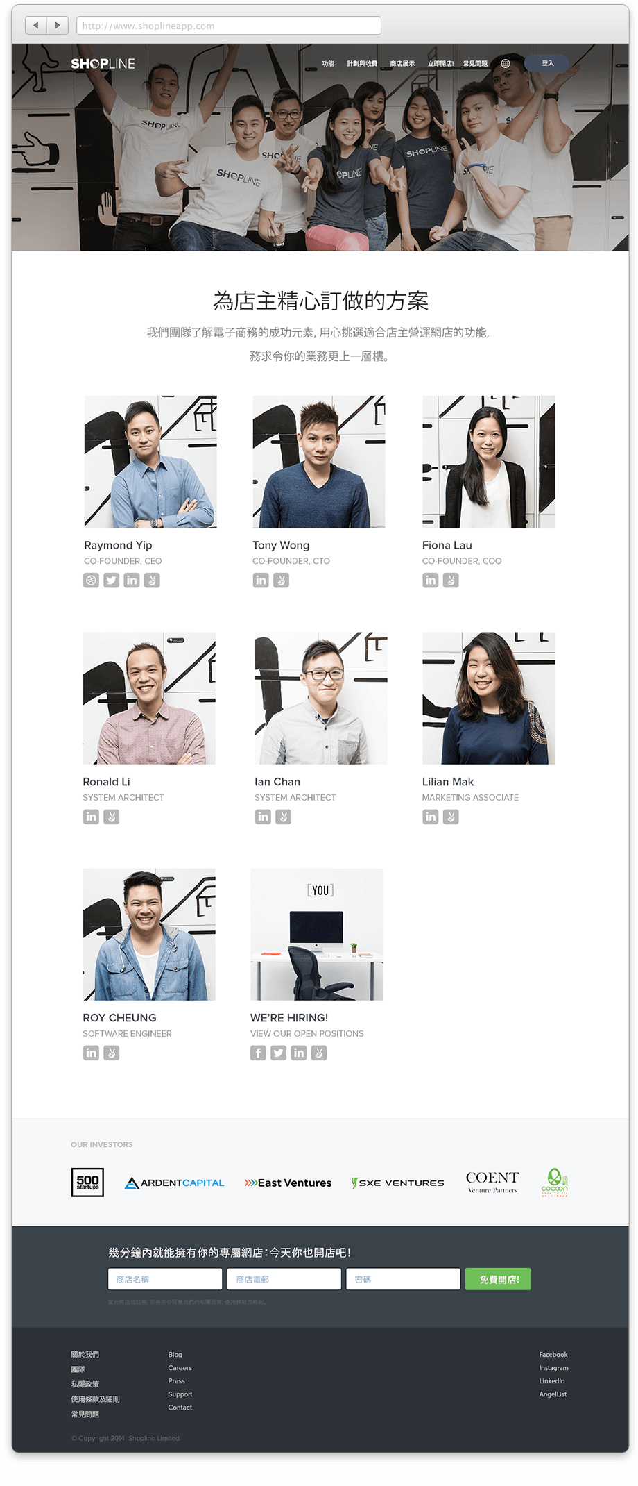
Shopline has just announced its seed round of fundraising and ahead of that announcement we wanted to also release our new website. Aside from just design and aesthetics, our objective here is to give our potential customers a better understanding of what our platform is and the different types of features that we offered. While some of the info we include might seem like common sense in other parts of the world, our target audience in the far East tend to require some more explicit description of what they’re actually paying for and why it would benefit their business. The challenge here is to convey the message that we are the easiest localised solution for anyone in Asia to set up an online store, and that we have everything that they would need to get started. All without clogging the page with unneeded design elements or data. At the end of the day, the goal here is to drive up conversion, and I we are on the right track with this homepage refresh.


Comments are closed.